
mood board
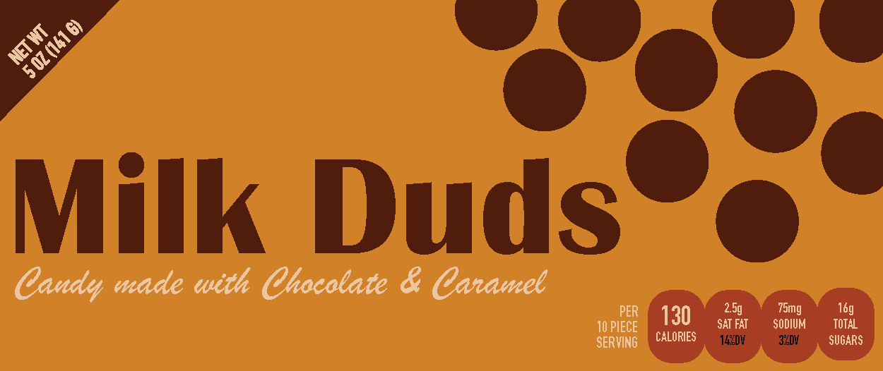
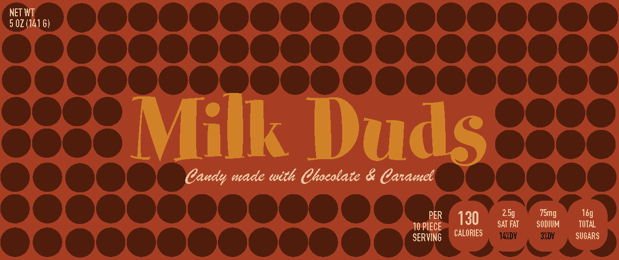
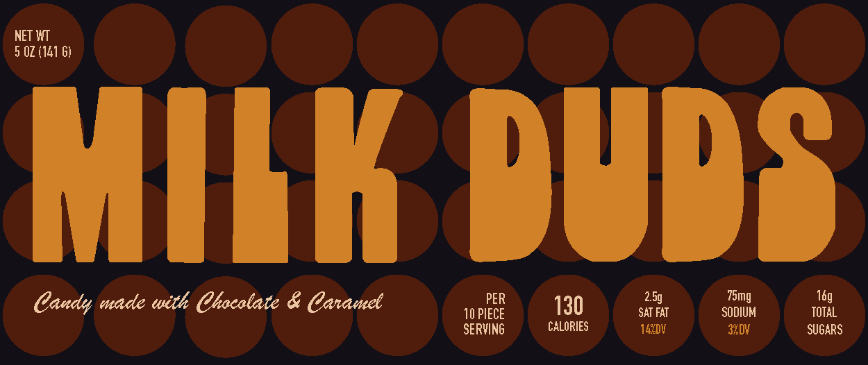
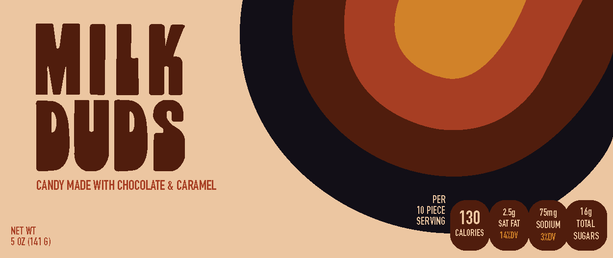
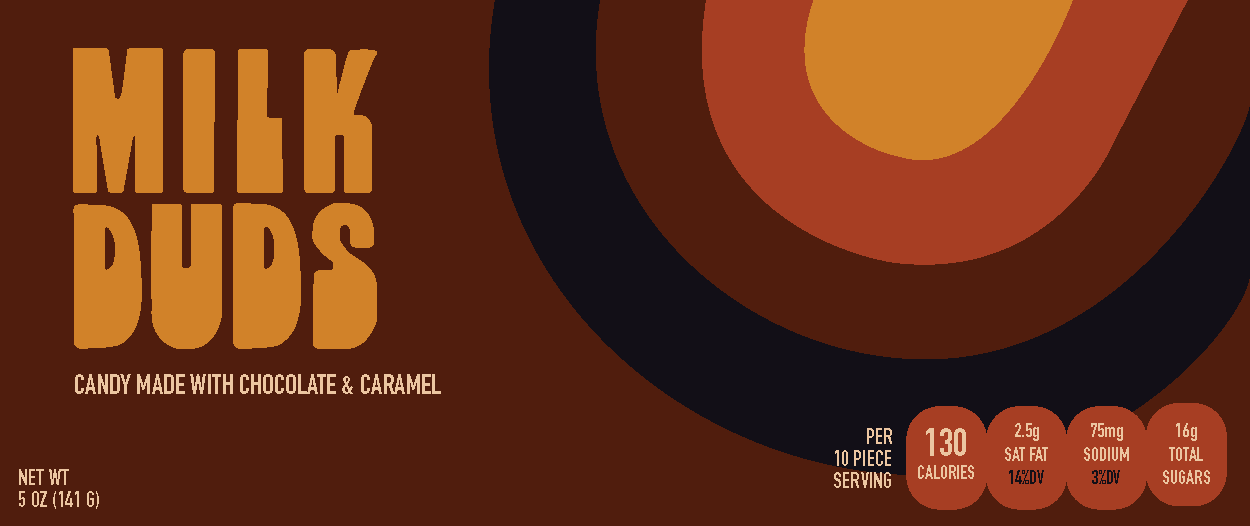
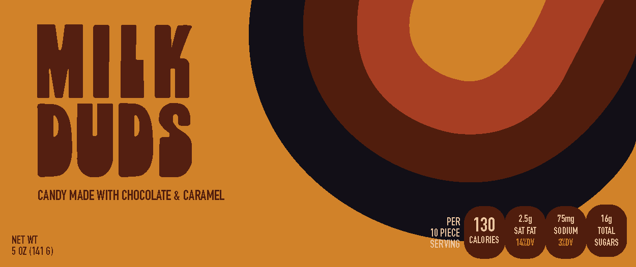
Bite into this retro redesign of one of my favorite candies. Inspired by the 60s & 70s I wanted to bring in a nostalgic quality to this packaging and hand drawn logo to draw in a younger demographic as well as invigorate older generations. With the circle pattern representing the candy the design also acts as a visual for a crowd in a dark cinema, where many indulge themselves in the movie experience with a box of Milk Duds in their hands.


mood board